In this post, we’ll explore our new Convert – HTML to PDF (V2) action and some of the additional capabilities it brings to the Power Platform above the existing Convert – HTML to PDF action. The new V2 action is built on the Chromium engine, providing improved support for modern HTML and CSS. It also covers webfonts and advanced layouts using Flexbox and CSS Grid, which are specific features our customers have requested, and we’re delighted to have delivered.
Note that our older ‘Convert – HTML to PDF’ action will continue to be available and supported alongside the new ‘Convert – HTML to PDF (V2)‘ action. However, we recommend building new flows with the V2 action, as it will yield improved results in most cases.
We are going to create a very simple flow to demonstrate the advanced CSS layout support of our Convert – HTML to PDF (V2) action. The flow will be triggered manually with the HTML data provided directly to the Encodian action, and the resulting PDF will then be emailed for review.
1. Create a new ‘Instant cloud flow‘
1.a. Flow name: Provide a name for your flow
1.b. Trigger: Select the ‘Manually trigger a flow‘ trigger action
1.c. Click ‘Create‘
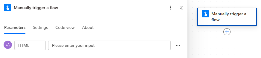
2. Configure the ‘Manually trigger a flow‘ trigger action
2.a. Click ‘Add an input‘ > Select ‘Text‘ > Enter the name ‘HTML’
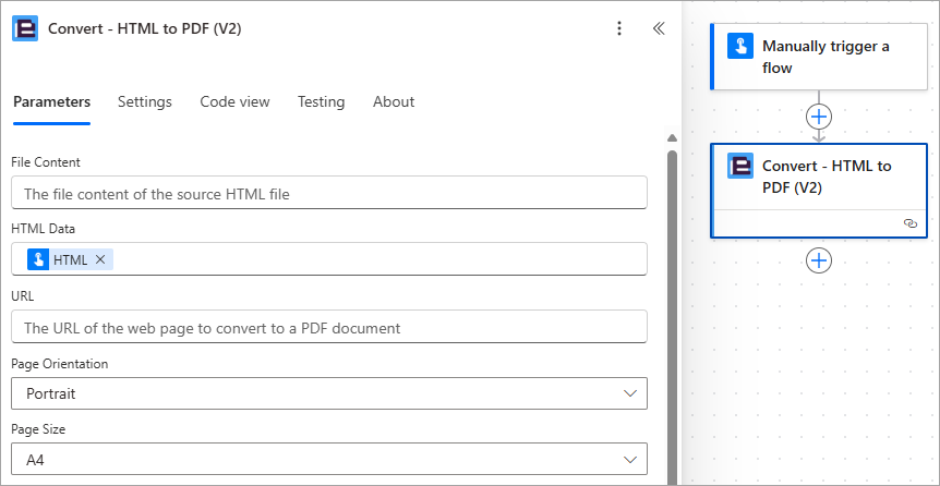
3. Add the Encodian Convert – HTML to PDF (V2) action
3.a. HTML Data: Select the ‘HTML‘ property provided by the ‘Manually trigger a flow‘ trigger action
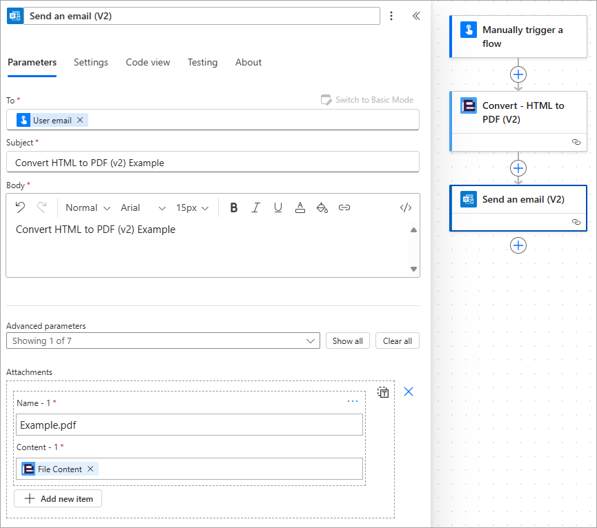
3. Add the ‘Send an email (V2)‘ action and configure as follows
3.a. To: Enter an email address or select the ‘User email‘ property provided by the ‘Manually trigger a flow‘ trigger action
3.b. Subject: Enter a relevant subject for the email
3.c. Body: Enter a relevant body for the email
3.d. Attachments – Name: Enter a relevant filename for the resultant PDF file
3.e. Attachments – Content: Select the ‘File Content‘ property provided by the Encodian Convert – HTML to PDF (V2) action
Flexbox (short for Flexible Box Layout) is a CSS layout model used in HTML to arrange elements in a container, especially useful when you need to distribute space and align items responsively to create those pixel-perfect layouts.
You can convert a container into a flex container by applying the following CSS attribute:
display: flex;All direct children of the flex container become flex items.
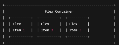
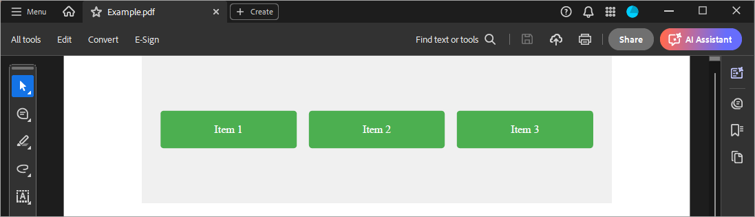
Let’s say you wanted to lay items out in a row, space them out evenly and vertically align them, for example:
To achieve this, you could use the following example HTML:
<html lang="en">
<head>
<meta charset="UTF-8">
<title>Flexbox Example</title>
<style>
.flex-container {
display: flex;
justify-content: space-between;
align-items: center;
height: 200px;
background-color: #f0f0f0;
padding: 20px;
}
.flex-item {
background-color: #4CAF50;
color: white;
padding: 20px;
font-size: 18px;
border-radius: 5px;
flex: 1;
margin: 0 10px;
text-align: center;
}
</style>
</head>
<body>
<div class="flex-container">
<div class="flex-item">Item 1</div>
<div class="flex-item">Item 2</div>
<div class="flex-item">Item 3</div>
</div>
</body>
</html>
Upon executing the flow with the HTML above, the following PDF document is created:
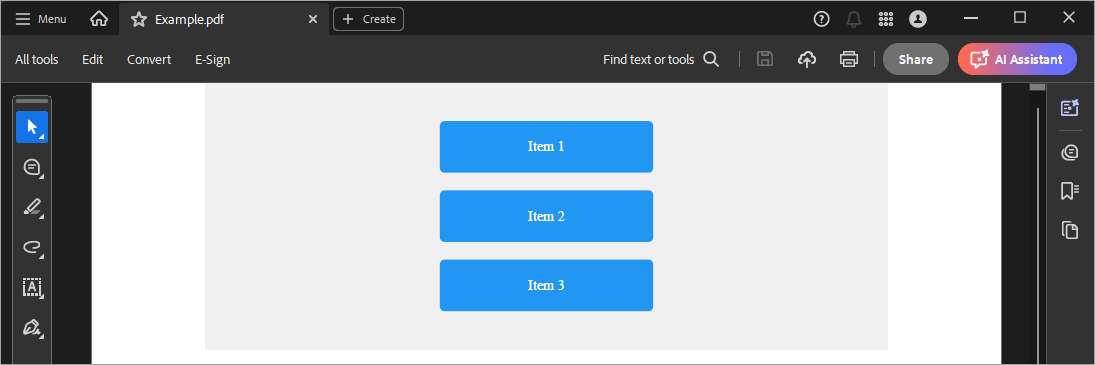
If instead, we wanted a column of flex items (items stacked vertically), we simply change the ‘flex-direction’ to ‘column’. For example, we can use this <style> code snippet instead:
<style>
.flex-container {
display: flex;
flex-direction: column; /* Stack items vertically */
justify-content: center;
align-items: center;
height: 300px;
background-color: #f0f0f0;
}
.flex-item {
background-color: #2196F3;
color: white;
padding: 20px;
margin: 10px 0;
border-radius: 5px;
width: 200px;
text-align: center;
}
</style>
Upon executing the flow, the updated HTML generates the following PDF document:
You can also wrap items and play around with different combinations of flex properties to create pixel perfect PDFs that responsively align and scale elements within them.
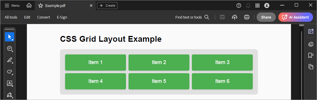
CSS Grid is another CSS layout approach, but the layout direction can be controlled in two directions. If you want grid items placed in a matrix of rows and columns, then CSS grid can help. You can explicitly place items anywhere. Consider the following HTML snippet, which renders three equal columns:
<head>
<meta charset="UTF-8">
<style>
body {
font-family: sans-serif;
background-color: #fafafa;
margin: 0;
padding: 40px;
}
.grid-container {
display: grid;
grid-template-columns: 1fr 1fr 1fr; /* 3 equal columns */
gap: 10px;
background-color: #e0e0e0;
padding: 20px;
border-radius: 10px;
}
.grid-item {
background-color: #4CAF50;
color: white;
padding: 20px;
text-align: center;
font-size: 20px;
border-radius: 5px;
box-shadow: 0 2px 5px rgba(0,0,0,0.1);
}
</style>
</head>
<body>
<h1>CSS Grid Layout Example</h1>
<div class="grid-container">
<div class="grid-item">Item 1</div>
<div class="grid-item">Item 2</div>
<div class="grid-item">Item 3</div>
<div class="grid-item">Item 4</div>
<div class="grid-item">Item 5</div>
<div class="grid-item">Item 6</div>
</div>
</body>
</html>
Upon executing the flow, this HTML generates the following PDF document:
We’re excited to bring this capability to Power Automate and the wider Power Platform through the Encodian Flowr ‘Convert’ connector with our new ‘Convert – HTML to PDF (V2)‘ action.
Flexbox and CSS Grid are powerful CSS layout tools that make it easy to arrange elements and to create flexible layouts with minimal code.
Using Flexbox, you can format invoice line items so that the item description aligns to the left and the quantity and price align to the right. You can create letterheads or footers where the logo is positioned on one side and the text on the other, with perfect spacing and alignment. You can align signature boxes and labels evenly across a row. The possibilities are endless.
With CSS grid, you can create structured areas in your invoice and quote templates, including headers, tables, totals, and footers. You can create multi-column reports with 2-3 column layouts like newsletters or brochures/flyers.
We’d love to hear about how you’re using advanced CSS layouts for document generation in the Power Platform with Encodian!
Search 200+ Actions to see how Flowr can save you time
Sign up for your free 30-day trial; no cards, catches, or contracts.
Don’t struggle! Try out our Premium Support packages today.
CEO

